BUMBLE REBRAND

Bumble allows users to browse through profiles to meet people online and form new connections that fit the categories of dating, friendship, and business. Bumble makes money by offering subscription plans that benefit users. By paying, users can get their profile in front of more local singles by activating the “Spotlight” feature. This means for 30 minutes, their profile will be one of the first shown to anyone who logs on. When users connect, only women can send the very first message. This is how Bumble earned the nickname “the female-friendly Tinder.”
I took on the challenge of exploring a rebrand for Bumble for my Brand Concepts course at Parsons School of Design. When approaching the rebrand, I kept in mind one main friction point. Bumble is not just a dating app, yet their current branding can suggest otherwise. Many people don’t know that Bumble can be used for more than just romantic connections.
CHARACTERS & ICONOGRAPHY
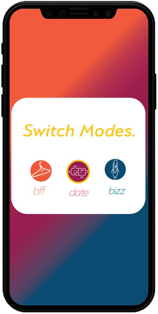
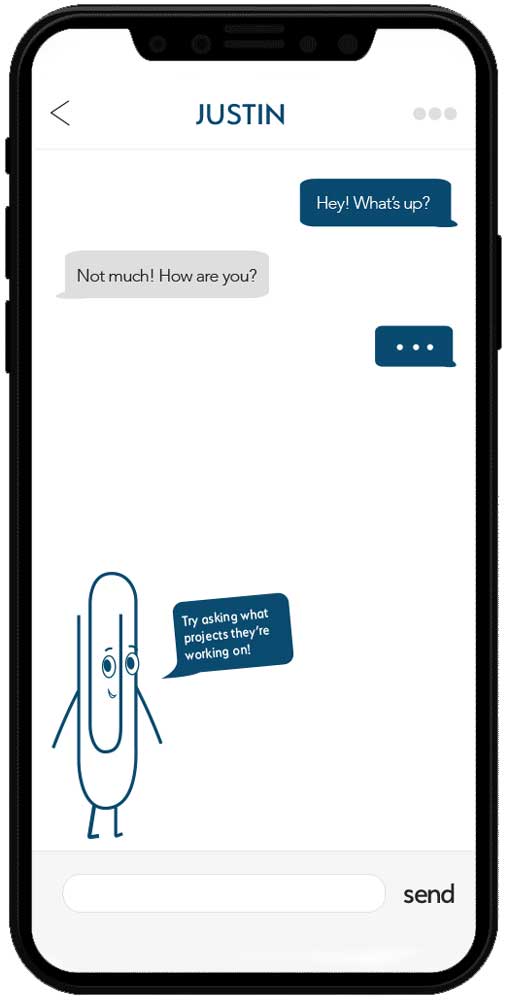
Online networking can be awkward. How do you casually start a conversation with someone? I find that this fear of being so open with others we haven’t even met yet can put a bad taste in user’s mouths about using a networking app such as Bumble. To fight this awkwardness, I used friendly icons that would act as a main focal point for the branding, and support users in their journey to form connections.
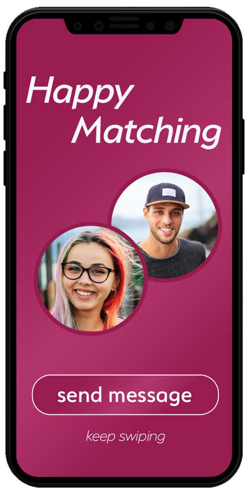
These icons, such as hangers, puzzle piece, and paper clips are random, but for that matter they can make viewers smile. They can lighten the mood and more importantly be used in visual advertisements to explain the different kinds of connections one could create by using Bumble. These characters would help to crush that initial fear of sparking up new conversation by being implimented into the UX/UI by giving suggestions for conversation starters.


UI/UX CONCEPTING
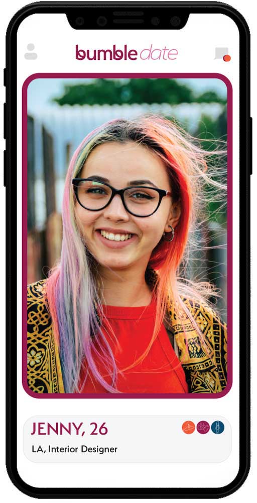
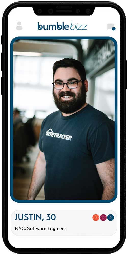
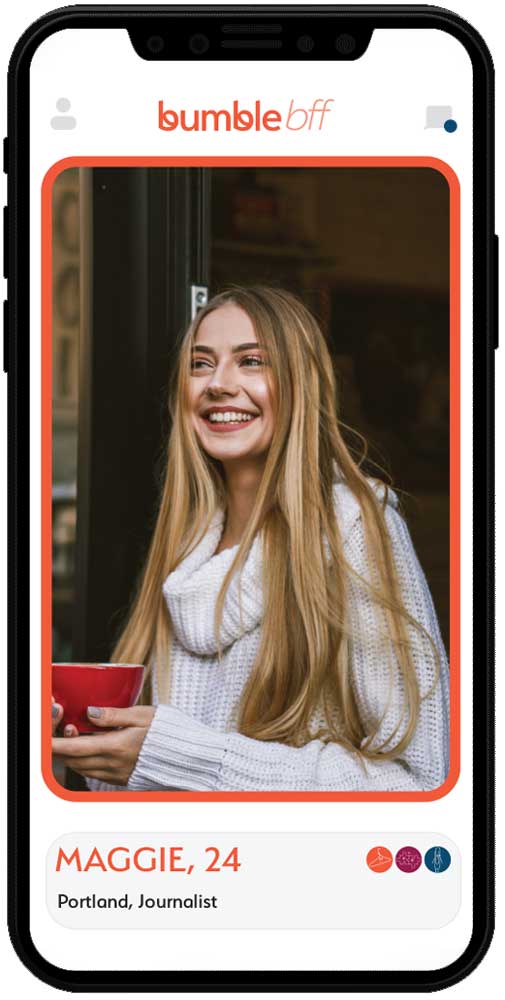
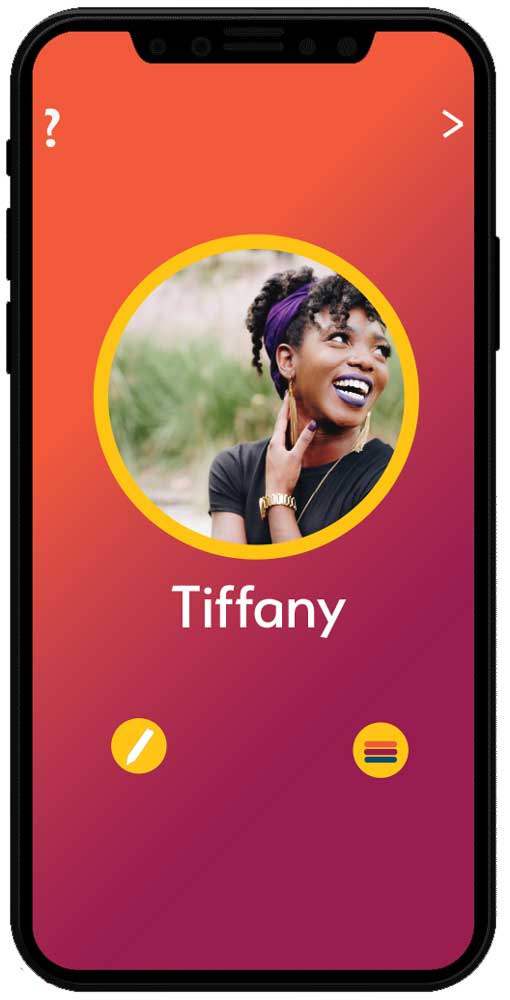
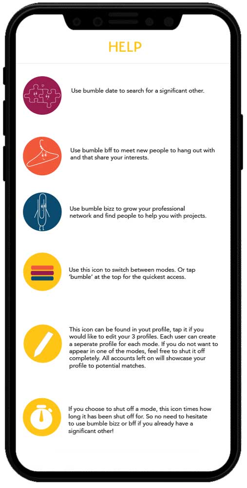
When researching, I found the current existing UX/UI of the Bumble app to be confusing for many reasons. It was difficult to understand how my profile was being presented for each category. For example, I felt that the bio I used for both the dating portion of the app, may not be appropriate for the business & friendship networking portion. This redesign uses clear icons to help users not only understand which form of relationship that they are browsing, but to also feel more confident in knowing how they are being presented to potential connections. On the “my profile” page that I created, users can switch off sections of the app and include a seperate bio for each type of networking to allow uses to be flirty when they date, funny when with friends, and profesional while doing business. The gradient in the background of the users profile page will be made up of the colors that correlate with the relationships that they have turned on. There is also a timer icon available to add security for those in romantic relationships to prove to their partner when and for how long Bumble Date has been turned off, to encourage more users to use the app for all forms of relationships.
To view the full pdf presentation that I created for my course, click here.